af-securities.com
Client
AF Securities
Services
Web Design, Development
Timeline
3 Month
Year
2025
AF Securities
UX Case Study — Legacy Website Analysis
Project Overview
AF Securities is a leading brokerage firm in the Egyptian market, offering a wide range of trading and investment services.
This case study analyzes the legacy website experience, focusing on usability, clarity, and conversion challenges that limited user engagement and business impact.
The Challenge
Despite offering strong financial services and a functional trading platform, the website struggled to communicate its value clearly, guide users effectively, and build trust before asking for commitment.
The main challenge was transforming a feature-heavy, information-dense interface into a user-centered, conversion-oriented experience.
Key UX Problems Identified
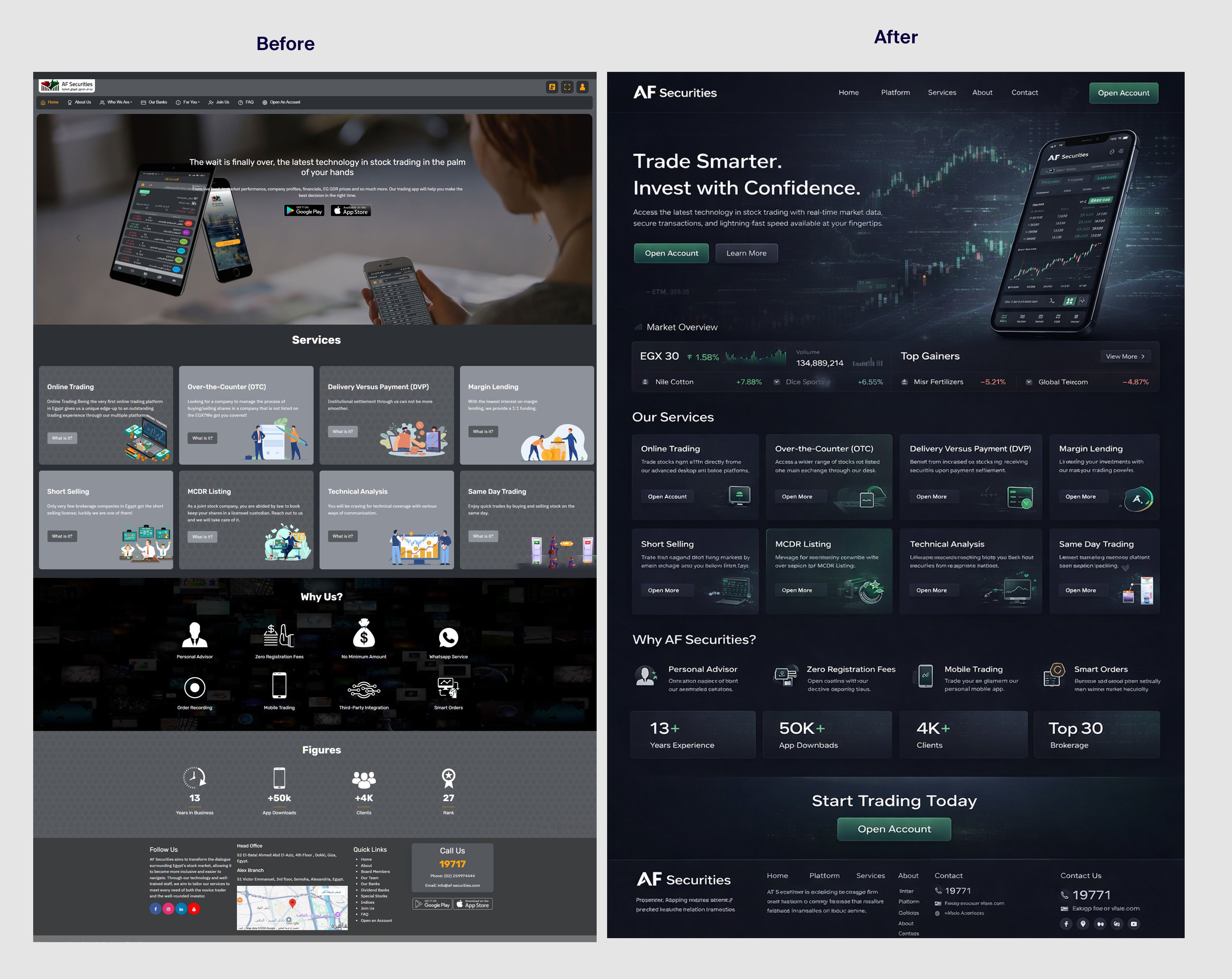
1. Unclear Value Proposition
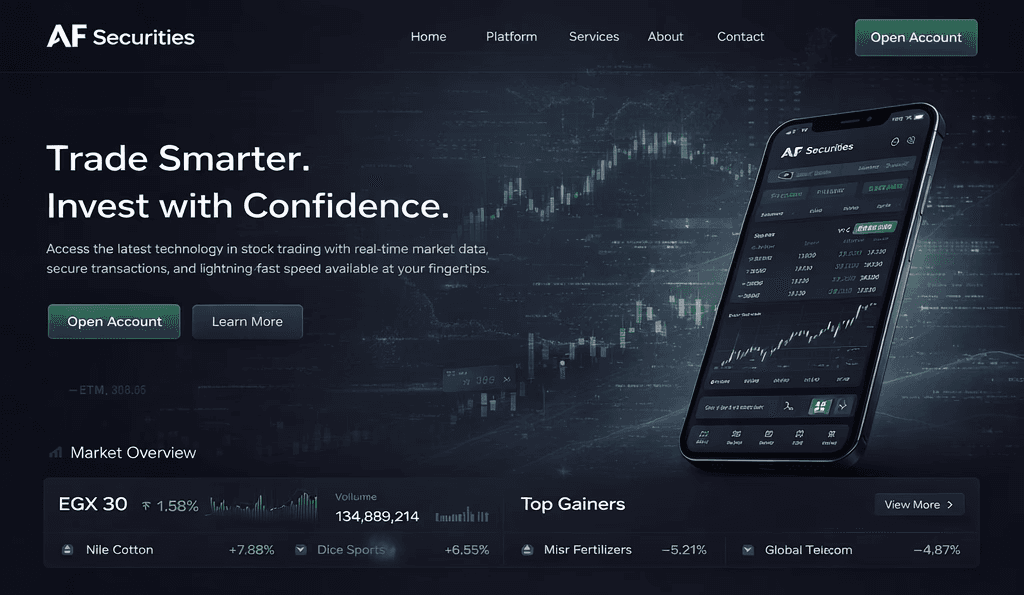
The hero section relied on generic messaging such as:
“The latest technology in stock trading in the palm of your hands”
This message did not clearly explain:
Who the platform is for
What makes AF Securities different
Why users should choose it over competitors
Impact:
Users were not able to understand the brand’s unique value within the first few seconds.
2. Content Overload & Weak Visual Hierarchy
The homepage presented too many elements at the same time:
Large hero banner
App promotion
Multiple service cards
Icons, figures, and CTAs competing for attention
There was no clear prioritization of content based on user intent.
Impact:
Users scanned randomly instead of following a guided journey, increasing cognitive load and reducing engagement.
3. Services Presented as a Flat Feature List
All services were displayed with equal weight:
Online Trading
OTC
DVP
Margin Lending
Short Selling
Technical Analysis
There was no distinction between:
Core services
Advanced services
Institutional offerings
Impact:
Users were not guided toward a primary entry point, making the decision process harder—especially for new or non-expert investors.
4. Early Conversion Pressure
The website pushed users toward actions such as:
App downloads
Opening an account
These CTAs appeared before:
Explaining how the platform works
Establishing trust
Providing educational context
Impact:
Users were asked to commit before feeling confident, leading to hesitation and drop-offs.
5. Weak Trust-Building Mechanisms
Although a “Why Us?” section existed, it relied mainly on:
Icons
Short labels (e.g., “Personal Advisor”, “Zero Fees”)
These claims lacked supporting explanations or proof.
Impact:
Trust was communicated visually, not substantively, limiting credibility—especially in a financial context.
6. Perceived Performance & Visual Heaviness
The combination of:
Dark backgrounds
Dense layouts
Multiple graphic elements
Made the interface feel heavy, even when technical performance was acceptable.
Impact:
Users perceived the site as slower and more complex than it actually was, affecting comfort and usability.
Root Causes
Design decisions prioritized feature exposure over user understanding
UX was not aligned with a clear product or conversion strategy
No defined user journey or segmentation (beginner vs. active trader vs. institutional user)
UX Insights
From analyzing the legacy experience, several strategic insights emerged:
Financial platforms require progressive trust-building, not immediate conversion
Users need clear guidance, not full system exposure at once
Services should be framed as solutions for specific user needs, not a flat list of capabilities
Outcome of the Analysis
This analysis became the foundation for:
Repositioning AF Securities as a product-led trading platform
Designing a clearer user journey
Reducing cognitive load
Aligning conversion with trust and understanding
My Role
UX Strategy & Product Thinking
UX audit and problem identification
User journey analysis
Content hierarchy and conversion logic
Strategic recommendations for redesign
Conclusion
The legacy website successfully showcased AF Securities’ capabilities but failed to translate them into a clear, user-centered experience.
This case study highlights the importance of:
Strong value communication
Intent-based content hierarchy
Trust-first UX design in financial products


