arabfinance website
Client
arabfinance
Services
Web Design, Landing Page
Timeline
8 Weeks
Year
2026
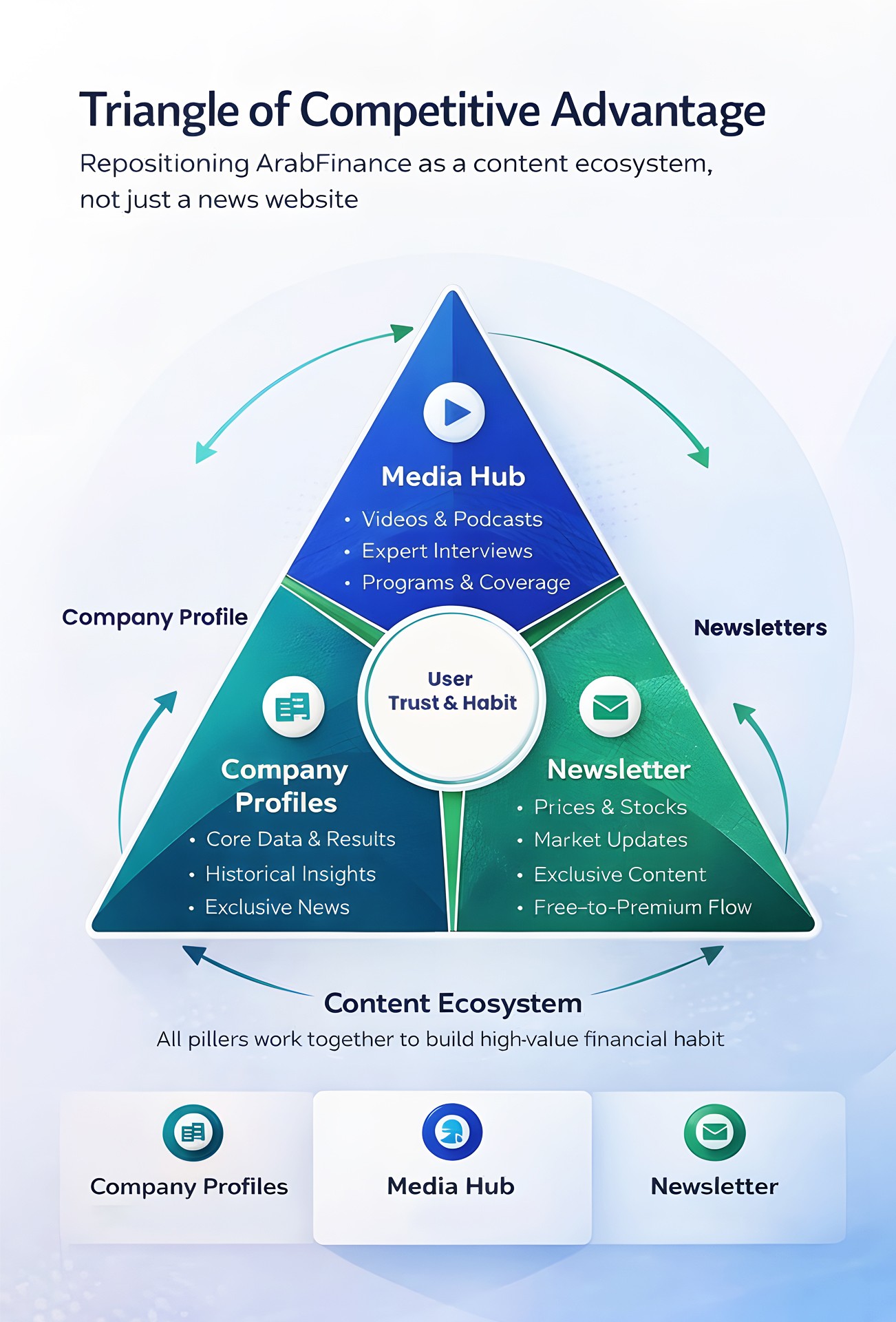
Arab Finance’s New Vision: A Financial Content Ecosystem
Introduction
This case study presents Arab Finance's new vision and UX, addressing engagement and monetization challenges. The platform is now a financial content ecosystem with three pillars: Company Profiles, Media Hub, and Newsletter
Combining company data, investor-led video/podcast content, and a newsletter, Arab Finance delivers a clearer experience that supports informed investment decisions and user trust.
Arab Finance — Case Study Summary
Problems, Evidence, and Logical UX Direction.
1. What Are the Existing Problems?
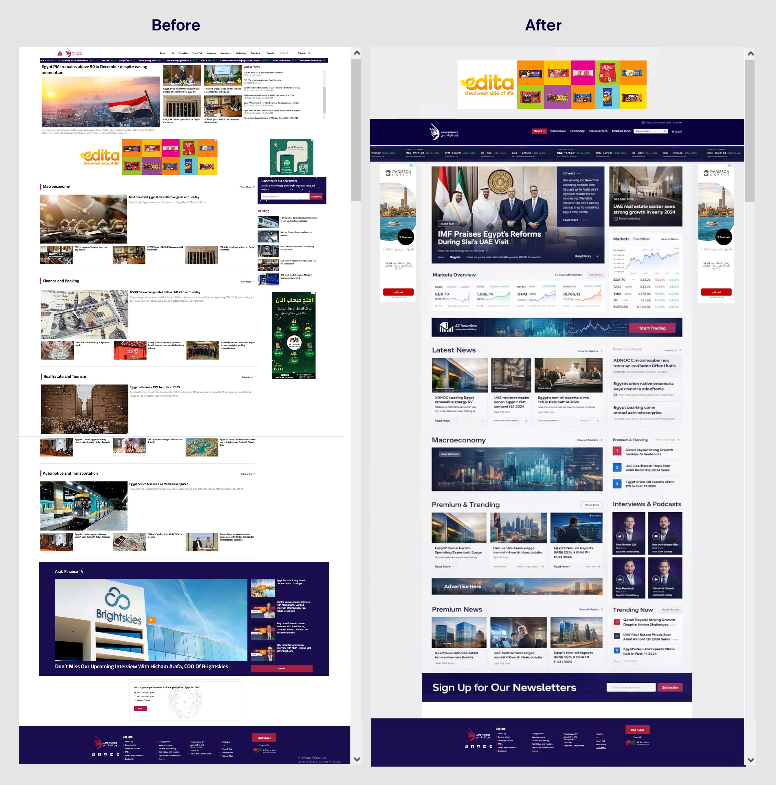
Problem 1: Content Overload & Weak Hierarchy
The homepage and internal pages present too much content at once.
News, prices, ads, widgets, and media compete visually without a clear hierarchy.
Why this is a problem
Users cannot quickly understand what matters most. They scan randomly instead of reading intentionally.
Evidence / Clues
High bounce rate
Low engagement time
Users scroll without interaction
Problem 2: Unclear Value Proposition
From the first screen, users do not understand what Arab Finance offers beyond being another financial news website.
Why this is a problem
If users don’t understand the value immediately, they won’t stay or return.
Evidence / Clues
Quick exits from homepage
No strong first interaction
Weak brand recall
Problem 3: Monetization Is Not Aligned with User Behavior
Ads and premium CTAs appear without considering where the user is in their journey.
Why this is a problem
Users are asked to pay or accept ads before trust and value are established.
Evidence / Clues
Low premium conversion
Ad blindness
User resistance to CTAs
Problem 4: Media Content Has No Product Structure
Videos, podcasts, and programs exist, but they are not organized as products with clear identity or navigation.
Why this is a problem
Media cannot build loyal audiences or attract long-term sponsors.
Evidence / Clues
Low return rate to media content
Weak sponsorship potential
Problem 5: Poor Perceived Performance
Even when technical performance is acceptable, the site feels heavy due to visual density and layout issues.
Why this is a problem
Users judge speed by feeling, not metrics.
Evidence / Clues
Early exits despite fast load times
User complaints about heaviness
2. Why Do These Problems Exist
The platform is optimized for publishing volume and ads, not user understanding.
UX decisions were made independently from product and monetization strategy.
There is no clear content prioritization based on user intent.
3. How Do We Solve These Problems? (UX Direction)
Solution 1: Shift the Product Mindset
Reposition Arab Finance from a news website into a financial content ecosystem.
Solution 2: Clear Content Prioritization
Reduce visual noise
Strong hierarchy
Content grouped by user intent
Solution 3: Newsletter as the Entry Product
The newsletter becomes the primary trust and habit-building product.
Why
Matches investor behavior
Builds weekly engagement
Creates a natural free → premium path
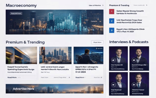
Solution 4: Media Hub with Program Structure
English Media content is organized into clear programs suitable for sponsorship.
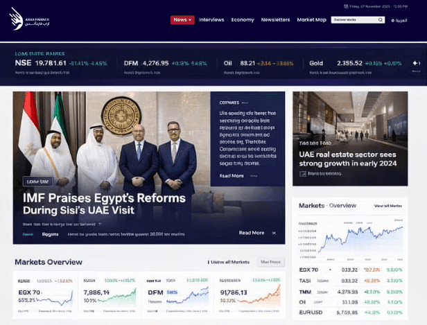
Solution 5: Homepage as a Value Gateway
The homepage guides users instead of flooding them.
4. What Is the Logical UX Flow?
User lands on homepage → understands value
User consumes curated content → builds trust
User subscribes to free newsletter → forms habit
User upgrades to premium → deeper value
Media & sponsorship support monetization without harming UX
6. UI, Responsiveness & Performance Issues (Additional Findings)
UI Structure & Grid System Issues
The current UI lacks a consistent and well-defined grid system.
Layouts appear visually unbalanced, spacing is inconsistent, and components do not align within a clear structural framework.
Why this is a problem
Without a proper grid system, visual hierarchy breaks down. Users struggle to scan content efficiently, and the interface feels chaotic rather than trustworthy.
Evidence / Clues
Inconsistent spacing between sections
Misaligned content blocks
Uneven column widths across pages
Responsiveness & Screen Size Problems
The website follows a desktop-first approach and does not adapt correctly to different screen sizes, especially tablets and intermediate breakpoints.
Why this is a problem
Users experience compressed layouts instead of responsive reflows, leading to poor usability on tablets and medium screens.
Evidence / Clues
Awkward layouts on tablet view
Text and cards shrinking instead of reorganizing
No clear breakpoint logic
Web Performance & Core Web Vitals Issues
The platform suffers from weak Core Web Vitals performance, particularly in perceived loading speed and interaction readiness.
Key issues observed
Poor LCP (Largest Contentful Paint)
Heavy DOM and excessive elements
Late-loading interactive components
Why this is a problem
Users attempt to interact with the interface before it is fully ready, leading to frustration and misclicks.
Evidence / Clues
High number of dead clicks
User interactions happening before page stability
Drop-offs during early page load
Impact on UX & Business
These UI and performance issues directly impact:
User trust
Content readability
Engagement duration
Conversion potential
Poor UI structure combined with weak performance perception amplifies existing UX problems rather than solving them.
UX Direction for UI & Performance Fixes
Establish a unified grid system
Define clear responsive breakpoints (desktop, tablet, mobile)
Reduce visual density and unnecessary components
Optimize Core Web Vitals (LCP, CLS, INP)
Align UI decisions with UX intent, not just aesthetics